ggplot( )
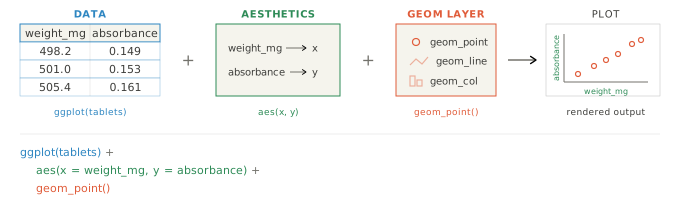
Create a plot by mapping data variables to visual aesthetics. ggplot() is from the ggplot2 package, which is part of the tidyverse.
Required Library
install.packages("tidyverse")
library(tidyverse)
Syntax
ggplot(data, aes(x = x_var, y = y_var)) +
    geom_*() # replace with a geom function like geom_point(), geom_line(), geom_bar(), etc.
ggplot() builds a plot object from a data set (often a tibble data frame), a coordinate system, and geoms. The data set is specified in the data argument, and the coordinate system is defined by the aes() function, where aes stands for aesthetics. You can add one or more geom_*() layers with + to draw points, lines, bars, and other marks. Widely used geoms include geom_point(), geom_line(), geom_bar(), and geom_boxplot().
Examples
Scatter plot
Line plot
Boxplot
Argument Overview
Required arguments must be included when using a function while optional arguments can be included on demand.
data — data frame used for plotting data frame | tibble Optional
The data frame that contains variables used in the plot. Inside aes(), you can refer to variables in the data frame by name. If omitted, data can be supplied in a later layer (for example inside geom_point(data = ...)).
ggplot(data = capsules, aes(x = time_min, y = pct_release))
Data Types: data.frame | tibble · Default: NULL
aes() mapping — aesthetic mappings uneval mapping Optional
Defines how variables map to visual properties like x, y, color, shape, linetype, or size. Aesthetic mappings connect data variables to visual properties so the appearance changes automatically with the data.
This example maps x and y, which place the data on the horizontal and vertical axes. These two mappings are the foundation of most ggplot charts.
ggplot(capsules, aes(x = batch, y = pct_label)) +
  geom_col()
This example maps color so each batch is drawn in a different color. Use this when you want to visually separate groups in the same plot.
ggplot(capsules, aes(x = time_min, y = pct_release, color = batch)) +
  geom_line()
This example maps shape, which gives each group a different point symbol. Shape is most useful in point-based plots where categories need to stay distinct.
ggplot(capsules, aes(x = batch, y = pct_label, shape = batch)) +
  geom_point()
This example maps linetype, which changes the pattern of the line for each group. It is useful when colors are limited or when a plot may be printed in grayscale.
ggplot(capsules, aes(x = time_min, y = pct_release, linetype = batch)) +
  geom_line()
This example maps size, so larger values are shown with larger points. Use size mapping when you want the magnitude of a numeric variable to be part of the visual encoding.
ggplot(capsules, aes(x = batch, y = pct_label, size = pct_label)) +
  geom_point()
Data Types: aes() mapping object · Default: aes() (empty mapping)
… — additional parameters in geoms varies Optional
Additional options are usually set inside the geom_*() layers you add after ggplot(). This is where you style the marks in the plot, for example by changing line width, point size, transparency, fill, or border color. Use styling within geoms to override global aesthetics set in ggplot() for specific layers.
ggplot(capsules, aes(time_min, pct_release)) +
  geom_line(linewidth = 1.2, color = "steelblue") +
  geom_point(size = 2.5, color = "steelblue", alpha = 0.8)
Data Types: varies by use case